Torchlight has always held a special place in my heart. For me, it wasn’t just a game that arrived at the right time to fill the gap between Diablo II and Diablo III. It was an experience that I would return to time and time again. It meant something.
The sequel made everything better, adding sorely-needed multiplayer. Over time, even though I still cherish that first single-player experience, the sequel didn’t hold up for me.
It was Blizzard’s latest entry in the click-and-slash genre that hooked me for the long run instead, thanks to Adventure mode and its Seasons, giving players a reason to return even when the base game remained pretty much unchanged.
Now, Torchlight 2 arrives on consoles during one of the busiest years in video games, doing the most to try and capture that initial player base while also grasping for newcomers that might have missed it the first time around.
2012 sounds like ages ago. Not only did Diablo III release then, but other games such as Dishonored and Telltale’s The Walking Dead came to life back then, cementing a legacy for years to come. Torchlight 2, despite its strong playerbase during the beginning and the mod support that kept it fresh and experimental, didn’t take off as I was expecting.
Same Towns, New Stories
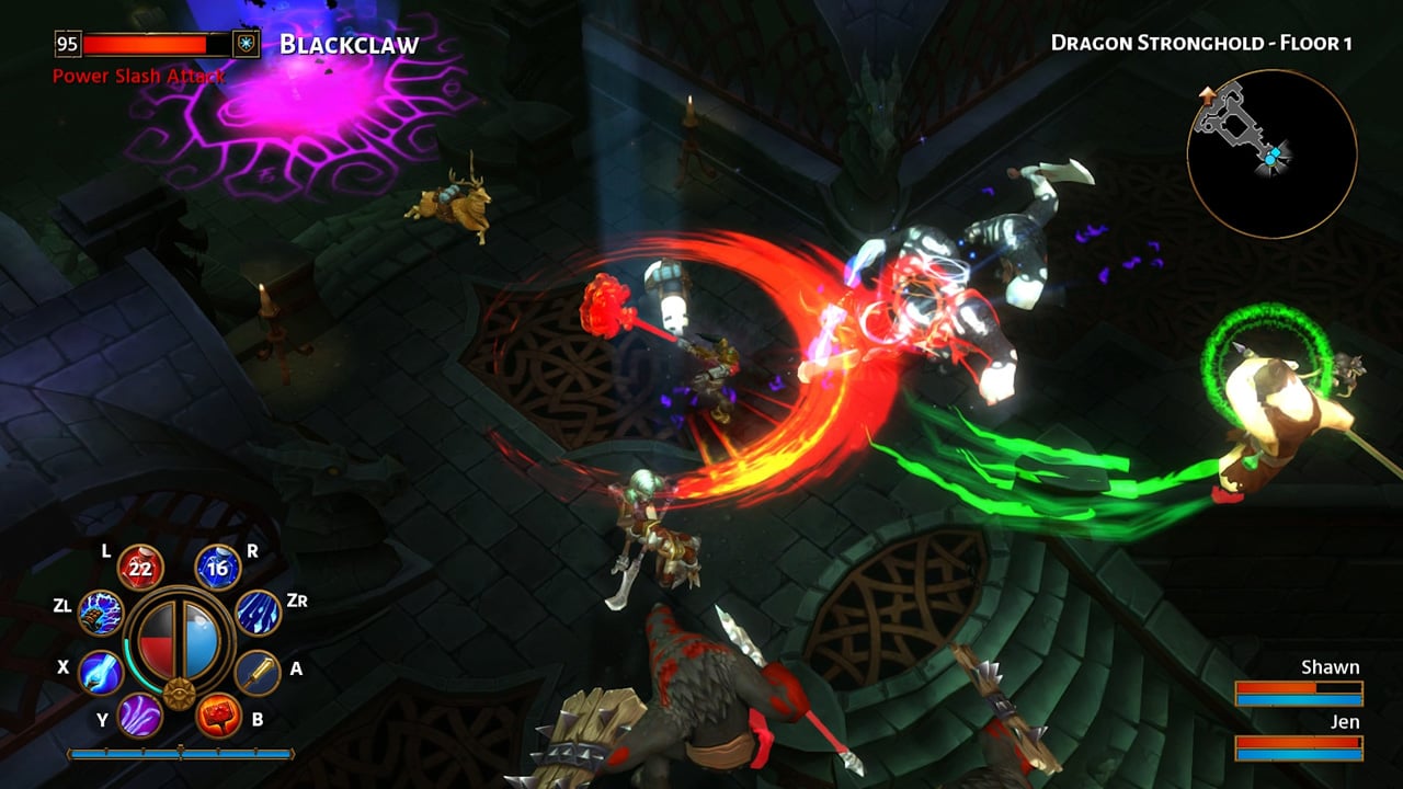
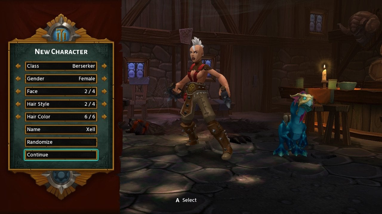
These new console versions of Torchlight 2 bring back the exact same content from the original release, although tuned up with a whole new interface to better adapt to consoles and, especially, gamepads. This is where this port excels the most: presenting each UI element in a clear manner, and allowing you to rebind buttons as you wish, either by adding attacks, powers, potions, or items.
Another significant change that will easily surprise veterans of Torchlight II comes when you speak to an NPC. Instead of zooming in as it used to be, now it takes you to a different window where the character is displayed on the left, and the text is bigger and clearer.
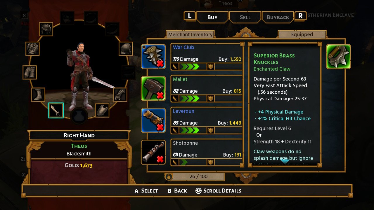
The same applies to rewards and items in general. It lacks a bit of the style from the original layout, for sure, but this is a game where dropping in an out of the inventory and other character windows is a frequent activity. Now, instead of being separated by three different sections for each side of the screen, everything is packed on the same screen, quick and easy to navigate using the bumpers.
The map is, by far, my new favorite aspect in this Torchlight 2 port. It’s located in the upper right side of the screen, in the same shape as always. But if you use the D-pad, you can expand it vertically, showing even more details of the areas surrounding you, or even deactivate it altogether. In both perspectives, you can also zoom in an out at any time.
Why is this important? Well, pretty much all games in recent memory that got ported onto the Nintendo Switch (and even Fire Emblem: Three Houses) suffer from a lack of legibility in terms of text and interface in general. In some cases, it’s not all that problematic when playing docked. But it becomes a hassle in handheld mode, often without an option to increase text sizes or make everything bigger.
In Torchlight 2, this was never an issue for me, and I’m grateful for the decision to focus on these aspects to try and improve this irregular but steady standard. This is all benefited by the native option to zoom in and out from the game itself, which has been kept in the port.
A Surprising Port
Controls and UI aside, this version of Torchlight 2 presents fairly decent performance all around. It’s hard to say how many frames-per-second it gets exactly, but I only notice drops when there are literally too many things happening on screen at once. Since this is a game that excels in that regard, it’s worth mentioning that it never becomes unplayable, though it’s not flawless.
The one true bummer here is that there are no current plans for new content. Adding DLC might be too late at this point, but a feature similar to seasons or even weekly challenges could make this an easier sell for folks who have already beaten the game, considering that there is no mod support here either.
Pros:
- Welcoming new interface
- Finally, a decent port to play in handheld mode
- Dozens of hours of content, along with the classic New Game +
- Both online and local multiplayer
Cons:
- Lack of substantial new content and plans for on-going content
Aside from exclusive pets and the revamped interface, there aren’t any significant reasons to go back to Torchlight 2 on the Switch other than to replay it with new friends in local mode or with other players online.
I love Torchlight 2, and I can’t wait to continue playing it on the go. But this port is also a reminder that Torchlight Frontiers is the next big thing in the series, and these versions are none other than a breeze of nostalgia looking for a place to settle in modern consoles, rather than a new beginning.
[Note: A copy of Torchlight 2 was provided by Panic Button for the purpose of this review.]


Published: Sep 6, 2019 05:21 pm